


How to Build a Conversion-Driven eCommerce Website
Design, UX & checkout flows that convert—build smarter with Logo Design Studios.

So youve got a great product, a killer business idea, and big dreams of making it in the eCommerce world. But heres the kickernone of that matters if your website isnt doing its job. In the world of online shopping, your website is your storefront, salesperson, and checkout counter all rolled into one. If any part of it drops the ball, you're losing potential sales.
Building a conversion-driven eCommerce website isnt just about slapping on a shopping cart and calling it a day. It takes thoughtful design, smooth user experience, and strategic layout choices to turn visitors into buyers. Lets break it all downstep by stepso you can build smarter, not harder.
First Impressions Matter (A Lot)
Lets start at the top. The moment a user lands on your homepage, youve got about 3-5 seconds to convince them to stick around. Thats it. And in that micro-window, your design has to do a ton of work.
A cluttered, confusing, or dated design is basically the digital version of a messy storefront with flickering lights. You wouldnt shop there, and neither will your visitors.
Instead, go for a clean layout, with bold imagery, clear messaging, and easy navigation. Use whitespace strategicallyits not just empty space, its what gives your content room to breathe.
Smart Design = More Conversions
Design isnt just about looking goodits about working well. Conversion-driven design means guiding your users attention exactly where it needs to go: toward the product and the purchase.
Heres what that looks like in action:
- Clear Call-to-Actions (CTAs): Add to Cart, Buy Now, Get Yoursmake them big, bold, and obvious.
- Consistent Brand Identity: Fonts, colors, tonethese should match your overall vibe and speak to your audience.
- Mobile-First Approach: More than half your shoppers are probably on mobile. Your site better be ready.
Think of your site layout as a sales funnel. Youre not just showcasing products; youre strategically leading users toward a purchase, every step of the way.
User Experience (UX): The Secret Sauce
Even if your site looks amazing, a frustrating UX can kill conversions faster than a slow internet connection. Great UX is invisibleits about removing obstacles so users can move through your site without thinking.
Heres what to focus on:
- Speed: Slow load times = high bounce rates. Aim for pages that load in under 2 seconds.
- Navigation: Keep your menus simple. Use categories that make sense. Dont make users hunt for your bestsellers.
- Search Functionality: This ones underrated. A smart search bar with predictive text can seriously boost conversions.
Want a pro tip? Watch a friend try to buy something from your site. If they get stuck or confused, fix whatever tripped them up. Simple as that.
Product Pages That Actually Sell
A product page is more than just a photo and a price tag. Its where decisions are madeso this page needs to work.
Make sure each product page includes:
- High-quality images from multiple angles
- Zoom functionality (yes, people use this!)
- Detailed, benefit-driven descriptionsnot just specs, but reasons to care
- Customer reviews and ratings (social proof is gold)
- Urgency cues like Only 3 left in stock! or countdown timers for sales
Also, ditch anything that slows down the process. Extra clicks, surprise fees, or vague return policies? Conversion killers.
Checkout: Where Too Many Carts Get Abandoned
Lets talk about the checkout flowthe place where most websites lose money.
Shopping cart abandonment happens when customers get overwhelmed, confused, or annoyed right before hitting purchase. The good news? Its fixable.
Heres how to streamline your checkout process:
- Guest checkout option: Dont force users to create an account. Its a major turn-off.
- Progress indicators: Let them know how many steps are left.
- Auto-fill fields: The less typing, the better.
- Trust signals: Display payment security logos, return policies, and support options.
- Simplify payment options: Accept multiple payment methodscredit card, PayPal, digital wallets.
A seamless checkout flow should feel almost boring. If your customer doesnt even notice it, thats a win.
Micro-Moments That Make a Macro Difference
Its not always about the big things. Small touches can nudge users toward conversion without them even realizing it.
Think:
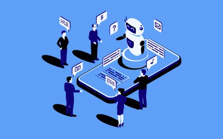
- Live chat or AI bots that answer quick questions
- Sticky Add to Cart buttons on mobile
- Exit-intent popups with discounts
- Personalized product recommendations based on browsing
These little conversion nudges add up. They build trust, reduce friction, and gently push users toward buying.
Data Doesnt LieTest Everything
Want to know what really works on your site? Test it. A/B testing isnt just for big corporations anymore.
You can run small experiments on:
- Button colors
- CTA wording
- Homepage layouts
- Product image formats
- Shipping offers
Use tools like Google Optimize or Hotjar to understand where users click, scroll, and bounce. Let the data tell you whats workingand whats not.
Keeping the Experience Consistent Across Channels
Your eCommerce site doesnt live in a vacuum. Visitors may come from Instagram, Google Ads, email newsletters, or even QR codes on product packaging. No matter where they land from, the experience should feel seamless.
That means:
- Visual branding is consistent across channels
- Offers and promotions match whats advertised
- Pages load well on all devices
- Messaging is unified across platforms
A disconnected experience causes confusion. And confusion doesnt convert.
Lets Talk Design with a Purpose
At the end of the day, its not just about looking prettyits about building a site that sells. Every color, button, and layout decision should serve a goal: conversions.
Thats why many successful eCommerce businesses turn to experienced design teams who understand the psychology behind what makes people click. Teams who dont just designbut think strategically.
One such team? Logo Design Studios. With years of experience crafting high-converting websites, they blend artistic flair with user-focused logic. From homepage to checkout, their approach is grounded in what worksbacked by real-world performance data and a deep understanding of how digital consumers behave.
If you're building or revamping your eCommerce site and want something that doesnt just look goodbut performs, its worth collaborating with pros who know the ropes.
Final Thoughts
In eCommerce, design isnt just decorationits strategy. From layout to UX to the final Buy Now click, every detail plays a role in turning visitors into buyers.
When you build with conversions in mind, youre not just putting up a websiteyoure building a business engine. One that works while you sleep.
So go ahead, sketch your vision, map your customer journey, and build something better than just beautiful. Build something that works.
And when youre ready to make it real, teams like Logo Design Studios are out there to help you bring it all together.